16 Top T-Shirt fonts for print-on-demand businesses
When it comes to selling t-shirts, selecting the right fonts is crucial for the success of your product design and marketing strategy. The fonts you choose significantly impact the overall appearance and feel of your shirts, affecting their ability to attract shoppers both aesthetically and emotionally. Additionally, a well-chosen font ensures that your creative t-shirt designs remain legible. With thousands of fonts at your disposal, how can you determine which ones are best suited for your design and target audience? Use our guide of EmbroInk to help you navigate the process of selecting the perfect t-shirt fonts for your business.
Best T-Shirt fonts for effective T-Shirt designs
Below is a curated list of sixteen of the best T-Shirt fonts for your custom t-shirt designs. Before diving into the specifics, it’s helpful to understand what distinguishes various font styles.
Understanding fonts
Fonts, also known as typefaces, define the design of letters and symbols used on T-Shirt fonts. They differ in several key characteristics:
- Weight: This refers to the thickness of a font’s lines relative to the height of its letters, influencing how bold or light the font appears.
- Style: This primarily concerns whether a font is upright or slanted. Some fonts are straight, while others, known as oblique, are slanted, typically from left to right. Additionally, upright and oblique fonts may also come in cursive styles, referred to as italics.
- Width: Fonts can vary in letter width, offering options for compression and expansion. Some fonts appear more stretched, while others are more compact.
- Serifs and Scripts: Fonts are often categorized based on the presence of small lines or strokes, known as serifs, at the ends of letters. Fonts with these are called serif fonts, while those without are termed sans serif fonts. Another significant category is script fonts, which mimic cursive writing and calligraphy.
Understanding these characteristics can help you choose fonts that convey the right tone for your designs—whether traditional or modern, formal or informal, playful or serious.
6 Top T-Shirt fonts for print-on-demand
Now, let’s explore some of the most popular t-shirt font options:
- Roboto
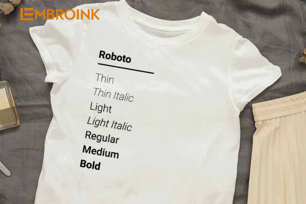
Designed by Google in 2011, Roboto is widely recognized as the default font for Android devices and Google services like YouTube. This sans-serif font is classified as “neo-grotesque,” emphasizing primitive simplicity. Roboto offers a range of weights from thin and light to bold and black, with oblique options instead of true italics. Its blend of simplicity and modernity makes it a versatile choice for t-shirts. - Proxima Nova
Created in 2005 by type designer Mark Simonson, Proxima Nova has become one of the most popular commercial fonts online. This sans-serif typeface merges the modern simplicity of neo-grotesque fonts with geometric elegance. Originally available in three weights with italics, it has expanded to include seven weights and three widths (normal, condensed, and extra-condensed), providing plenty of flexibility for t-shirt designs. - Futura
Originating in 1927 alongside the Bauhaus design movement, Futura is a geometric sans-serif font. It emphasizes shapes like circles, triangles, and squares, conveying a sense of futuristic efficiency with a vintage touch. This font is ideal for designs that aim for a modern yet timeless aesthetic. - Oswald
Designed by Vernon Adams, Oswald is a modern sans-serif font that reimagines the classic Alternative Gothic, which has been in use since 1903. Following Adams’ tragic passing in 2016, his design legacy continues through Oswald. This font is characterized by its bold, striking appearance and offers seven weights, ranging from extra light to heavy regular. Oswald’s strong visual impact makes it an excellent choice for t-shirts that aim to grab attention. - Bebas Neue
Created by Japanese type designer Ryoichi Tsunekawa in 2005, Bebas Neue is a free sans-serif font known for its strong lines, pleasing shapes, and simplicity. With forty styles available, it offers three widths and multiple weights, including italics. This versatile font is ideal for headlines, captions, and packaging, making it a great choice for impactful t-shirt designs. - Impact
Designed in 1965 by advertising design director Geoffrey Lee, Impact gained popularity after being included with Microsoft Windows in 1998. This bold sans-serif font features thick weights and compressed spacing, making it perfect for large messages against white backgrounds. However, its minimal interior space may hinder readability at smaller sizes. - Montserrat
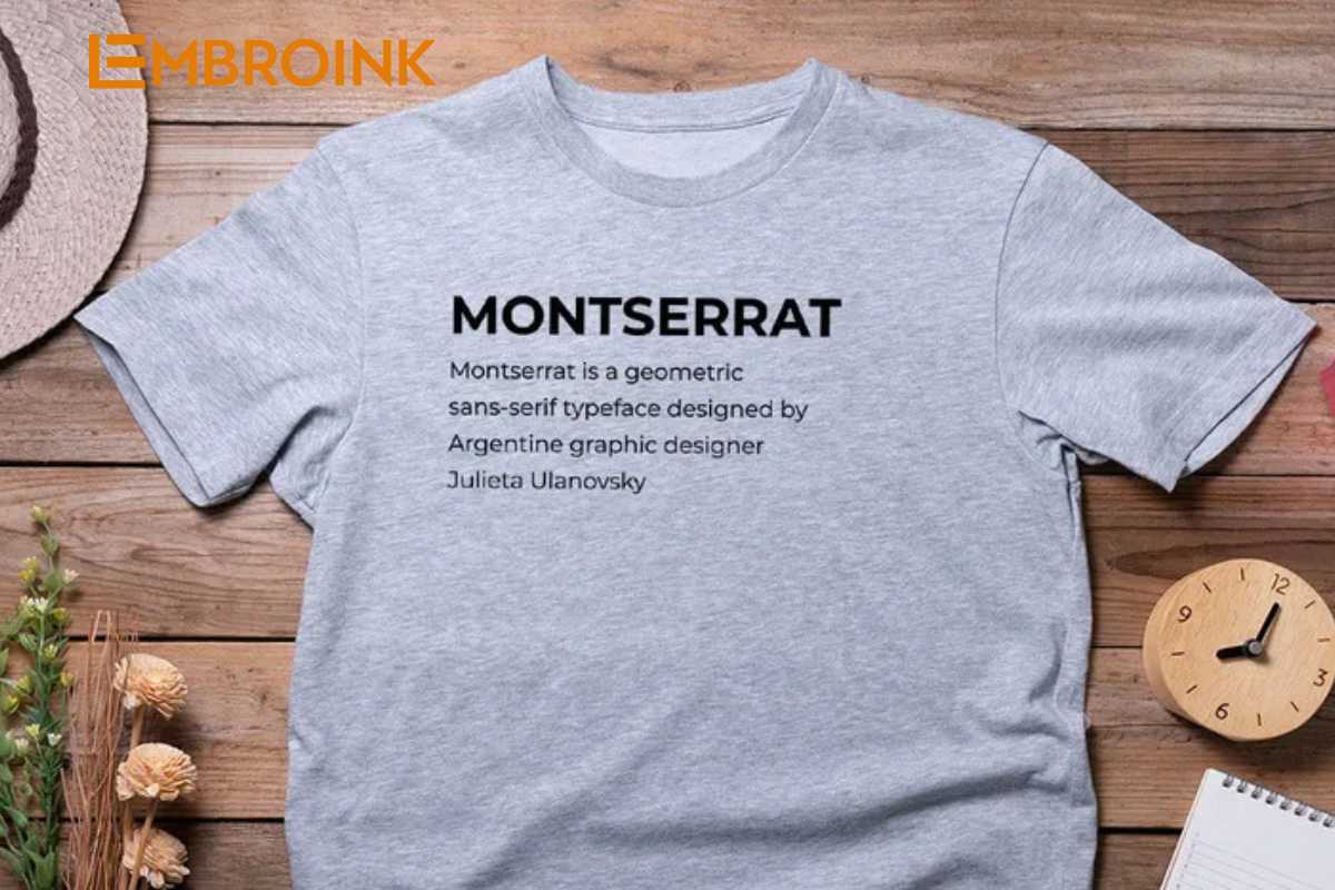
Designed by Argentine graphic designer Julieta Ulanovsky in 2011, Montserrat draws inspiration from early twentieth-century signage. This geometric sans-serif font features tall letters with short extensions below the baseline, resulting in high legibility, even in smaller sizes. Montserrat is a great choice for modern, clean designs. - Baskerville
Created in the 1750s by English type designer John Baskerville, this serif font is known for its sharp lines and high contrast, which enhances legibility. Baskerville comes in six styles, including bold and italic options, making it suitable for both traditional and contemporary designs. - Georgia
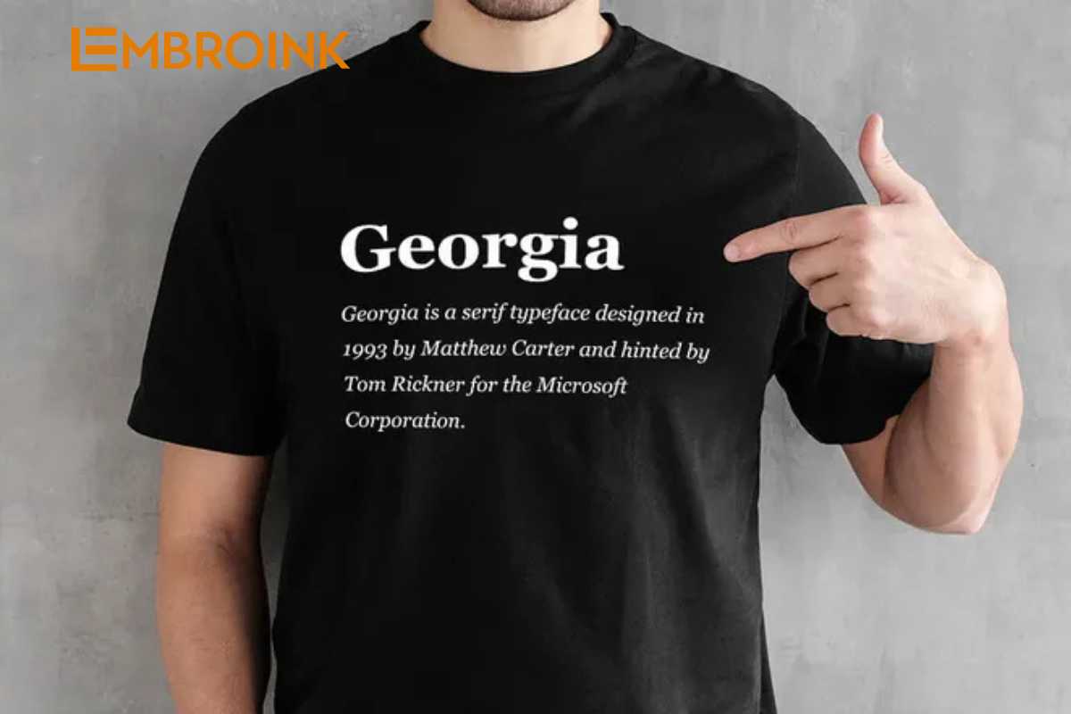
Designed by British type designer Matthew Carter in 1993, Georgia was created for easy readability on small screens. This serif font combines bold weights and generous spacing to ensure clarity. With options for regular, bold, italic, and bold italic, Georgia is a reliable choice for t-shirts aiming for a classic yet approachable look. - Garamond
Named after the sixteenth-century French engraver Claude Garamond, this family of serif fonts features fine serifs that lend an elegant, informal touch. While Garamond can be challenging to read in small sizes, it is often favored for book printing due to its vintage charm. - Self Modern
Designed by French typographer Lucas Le Bihan in 2016, Self Modern is a serif font inspired by Japanese typefaces. It features even spacing for high legibility and comes in text, regular, and italic styles, making it a stylish choice for various designs. - ChunkFive
Introduced by The League of Moveable Type in 2009, ChunkFive is a slab serif font inspired by American Old West woodcuts and posters. Its fat, bold letters work best for large display formats, making it a perfect choice for eye-catching t-shirt designs. - Brush Script
Invented in 1942 by American typographer Robert E. Smith, Brush Script is an elegant script font that mimics handwritten cursive styles. While it has a casual feel, its readability can diminish in smaller sizes, making it best suited for larger text applications. - Damion
Another free script font by Vernon Adams, Damion features big, open letters that prioritize legibility. This light, cursive-style font is ideal for large displays and adds a playful touch to t-shirt designs. - Lobster
Designed by Argentine typographer Pablo Impallari, Lobster is a bold, condensed script font that supports multiple letter variations through the OpenType format. Its stylish design makes it perfect for large displays, allowing your t-shirt designs to stand out. - Pacifico
Also designed by Vernon Adams, Pacifico is a free script font featuring a curly, informal cursive style. Its eye-catching appearance comes in light, regular, and bold styles, making it versatile for a range of creative t-shirt designs.
Selecting the right font is essential for effective t-shirt designs, impacting both visual appeal and readability. Use this list to explore fonts that align with your brand’s personality and resonate with your target audience!
How to choose the best font for T-Shirt fonts
Now that you have a better understanding of your font options, let’s go over some guidelines to help you select the best fonts for your t-shirt designs. Here are key considerations to keep in mind:
Marketing
Your choice of t-shirt fonts significantly impacts your marketing efforts by influencing how your target audience perceives your brand. Think about your brand identity and target market when selecting a font. For instance, if you’re designing quirky t-shirts for kids, opt for a playful font. Conversely, if you aim to create inspirational messages for adults, a more elegant font may be appropriate. If your brand is positioned as a luxury clothing line, choose a font that conveys quality and sophistication. Ensure your font aligns with your branding strategy and resonates with your intended audience.
Theme
Your fonts should enhance the themes of your custom t-shirt designs. Consider how the font complements both the artwork and the textual message. For example, if the font serves as a logo, it should effectively represent your company’s name. A font that carries a message should match the mood you’re trying to convey, reinforcing the overall theme of your design.
Composition
Artistically, your font should support the overall composition of your t-shirt design. Pay attention to factors such as size, weight, spacing, color, and how it appears against the shirt’s background. Select a font that harmonizes with the aesthetic of your custom t-shirt designs.
Legibility
A good font must be legible. This is especially crucial for t-shirts with longer messages or quotes. Consider whether your selected font can be easily read both up close and from a distance, ensuring that your message is clear to viewers.
Licensing
While US copyright law doesn’t protect the artistic design of typefaces, it does protect the software programs used to create fonts. Since many fonts are digitized, you may need a license to use certain fonts commercially. Always check if the font you want is licensed for commercial use and whether any associated fees fit within your budget.
Tips for combining fonts
With so many bold font options available, you may wonder about combining multiple styles. While you can create t-shirt designs using a single font, combining fonts can help you achieve a more dynamic look. Here are some tips for successfully blending fonts:
Avoid using too many different fonts
While combining fonts can enhance your design, using too many can lead to visual chaos. Stick to two or three fonts at most to maintain harmony in your t-shirt designs.
Use fonts with similar X-Heights
To ensure your fonts fit together cohesively, select those with similar x-heights. The x-height refers to the height of the lowercase “x” character, which serves as a baseline for comparing font sizes. Choosing fonts with comparable x-heights will create a balanced look.
Select fonts for visual impact
If you choose to T-Shirt fonts, do so with a specific visual effect in mind rather than randomly mixing them. Consider the impact you want your design to have and how different fonts can contribute to that effect. For instance, combining bold and light fonts can help emphasize particular words.
Develop a font hierarchy
Organizing your fonts into a visual hierarchy can enhance your design. If your t-shirt features a primary and a secondary message, you might select a larger, bolder font for the main message and a smaller, more delicate font for the subheading. Experiment with different font placements to establish a clear hierarchy.
Choosing the right font for your T-Shirt fonts design is crucial for effective branding and communication. By considering factors such as marketing, theme, composition, legibility, and licensing, as well as following tips for combining fonts, you can create eye-catching and cohesive designs that resonate with your target audience.

