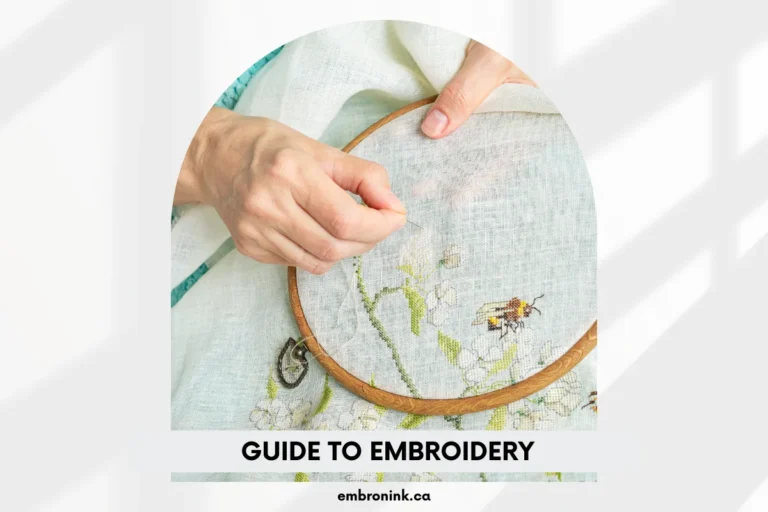
Gradient embroidery: Everything you need to know
Embroidery has long been a go-to choice for custom apparel, known for its elegance and exceptional durability that far surpasses what prints can achieve. But what happens when traditional embroidery meets cutting-edge technology?
Introducing unlimited color embroidery, a technique that creates gradients—a smooth transition between colors—giving your designs a vibrant, lifelike quality that truly stands out. Gradient embroidery is an advanced method where white thread is dynamically recolored to produce a seamless gradient effect with multiple colors.
Imagine the possibilities with this technology! From branded merchandise to personalized gifts and custom clothing, gradient embroidery offers a level of detail and vibrancy that standard embroidery cannot match. At EmbroInk, we’ve perfected this technique, ensuring that your designs are both stunning and of the highest quality.
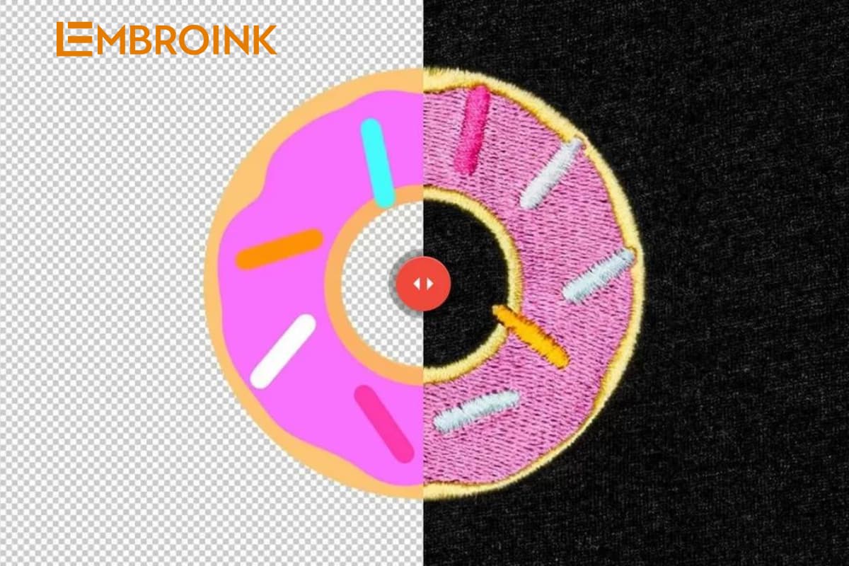
Gradient embroidery examples
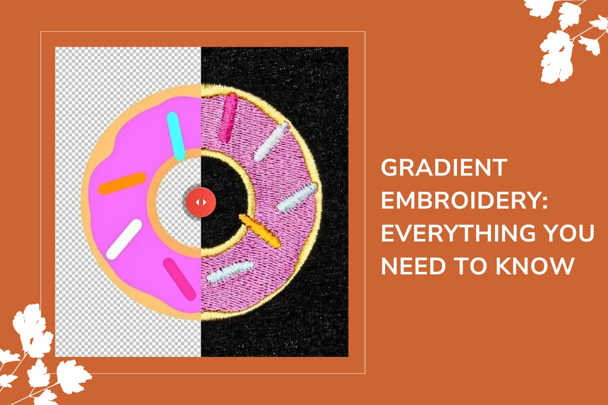
Here’s a detailed comparison of gradient designs utilizing unlimited color embroidery versus standard embroidery techniques. On the left side, you will see the digital renderings of the designs, which provide a clear visualization of how the colors are intended to blend and transition. On the right side, we present the actual embroidered samples, showcasing how each technique brings these digital designs to life.
- Unlimited Color Embroidery: This advanced technique allows for seamless and continuous color transitions, resulting in gradients that are both vibrant and lifelike. With unlimited color embroidery, the design can achieve smooth blends from one hue to another, creating a fluid and dynamic appearance that stands out with remarkable depth and richness. This technique leverages sophisticated embroidery machines that dynamically recolor the thread in real time, enabling the creation of intricate and nuanced color effects that mimic high-quality digital prints.
- Standard Embroidery: In contrast, traditional embroidery methods are limited to a finite range of colors, which often results in more segmented or blocky gradient effects. These conventional techniques use pre-determined thread colors and require frequent changes, leading to less smooth transitions and a more fragmented appearance. The result can sometimes appear less refined and less capable of achieving the smooth, continuous gradients seen in modern embroidery methods. Traditional embroidery may not capture the full depth and vibrancy of the design, making it less effective for creating complex, gradient-rich visuals.
This comparison highlights the significant advantages of unlimited color embroidery in achieving sophisticated and seamless gradient effects, offering a striking visual impact that surpasses the capabilities of standard embroidery techniques.
Stitch types for gradient embroidery
The choice of stitch type can significantly impact how gradients are rendered. Our digitizers select the most suitable stitch types based on your design to achieve the best results.
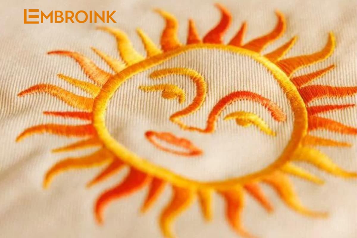
Satin Stitch
- Description: Satin stitch is a widely favored technique in embroidery, distinguished by its tightly spaced, flat stitches that cover fabric sections. This method creates a sleek, smooth, and glossy surface reminiscent of satin fabric.
- Gradient Effect: The dense and uninterrupted nature of satin stitch facilitates flawless color transitions, with the gradient flowing seamlessly along the direction of the stitching. This technique significantly enhances the gradient effect, providing a fluid and elegant appearance similar to the graceful motion of calligraphy or handwriting. The result is a sophisticated and visually striking gradient that showcases the intricacy and depth of the embroidery design.
Tatami Stitch
- Description: The tatami stitch is designed for filling larger areas within an embroidery design. It features parallel running stitches arranged in a woven pattern, evoking the texture of traditional Japanese tatami mats.
- Gradient Effect: This stitch allows for linear gradients to transition smoothly across the design. However, due to its inherently linear arrangement, tatami stitch is not suitable for achieving radial or circular gradients. The linear nature of the stitch limits its ability to create smooth transitions in circular patterns, making it more effective for designs that feature straightforward, directional color shifts.
Run Stitch
- Description: Run stitch is a fundamental and simple embroidery technique commonly employed for outlining or adding detailed elements to a design. It consists of single, continuous stitches that trace along the contours of the design.
- Gradient Effect: Although run stitch is not typically used for creating gradients, it can introduce some color variation within a design. However, it lacks the ability to achieve smooth and seamless color transitions compared to satin or tatami stitches. Run stitch’s primary use is for outlining and detailing rather than for producing the fluid gradient effects seen in other stitching techniques.
By selecting the appropriate stitch type, gradient embroidery can bring depth and vibrancy to your designs, making them truly stand out.
Gradient embroidery design best practices
To achieve smooth transitions, vibrant colors, and a professional finish in gradient embroidery, follow these tips:
Avoid neon and metallic colors
- Color Limitations: The white recycled polyester thread used in unlimited color embroidery is dyed with CMYK inks, which imposes restrictions on the production of highly saturated neon or metallic colors.
- Result: As a consequence, neon and metallic hues may not translate effectively into embroidery. These colors often appear dull, may shift in hue, or fail to meet the expected vibrancy and intensity. The limitations of CMYK inks mean that while these colors look striking in digital or print formats, they can lose their impact and visual appeal when rendered through embroidery techniques.
Consider space sizes
To achieve flawless color transitions in gradient embroidery, it’s crucial to design gradient-filled shapes with ample space. This consideration allows the embroidery machine to adjust the thread color gradually and precisely, enabling it to create a seamless gradient effect that closely resembles the smooth transitions found in Direct-to-Garment (DTG) printing. When gradient-filled shapes are designed with sufficient space, the machine has enough room to manipulate the color changes effectively, ensuring that the gradient flows smoothly and consistently across the design.
Conversely, if the design lacks adequate space for the gradient transitions, the result may be choppy or uneven, with noticeable breaks in color flow that detract from the overall visual quality. Proper spacing not only enhances the aesthetic appeal of the embroidered design but also ensures that the final product maintains the intended vibrancy and depth, creating a professional and polished look.
Avoid small details
For optimal results in gradient embroidery, it is essential to choose large, simple, and filled shapes. This design approach allows for a more effective color transition and ensures that the gradient effect remains smooth and uninterrupted. Small or intricate run stitch details can interfere with the gradient transition, creating disruptions and affecting the overall appearance of the design.
By focusing on larger, simpler shapes, you minimize potential issues and allow the embroidery machine to blend colors more seamlessly. This strategy not only enhances the visual appeal of the gradient but also maintains a clean and polished look, ensuring that the final embroidered design is both striking and professional.
Skip radial designs
Radial, or circular, gradients present significant challenges in embroidery. Achieving smooth and consistent color transitions in a radial pattern is difficult due to the nature of the stitching process. Circular gradients often struggle to blend seamlessly, resulting in uneven or segmented color transitions that detract from the overall design.
To avoid these issues and ensure a high-quality gradient effect, it’s best to steer clear of radial gradients in your embroidery designs. Instead, opt for linear gradients or other shapes that allow for smoother and more controlled color blending, which can better showcase the intricate details and vibrant transitions of your design.
Avoid photographic images
Photographic images, with their intricate shading and extensive color ranges, are generally unsuitable for gradient embroidery. The complexity of photographs can be difficult to replicate accurately with embroidery threads, often resulting in muddled or unclear designs. For optimal results, it’s better to use stylized graphics or illustrations.
These types of designs are more easily adapted to gradient embroidery, as they simplify color transitions and allow for a more defined and recognizable final product. By choosing stylized graphics, you ensure that the gradient effect remains clear and impactful, providing a visually appealing result that effectively showcases the depth and vibrancy of the embroidery.
By following these best practices, you can enhance the quality and impact of your gradient embroidery designs, ensuring they stand out with smooth, vibrant transitions.